Launching a Global Movement to End Postpartum Haemorrhage

PPH20presentation
Client
The World Health Organisation (WHO)
Themes
  • Empowering Women and Girls
  • Health Care
  • Health Equity
  • Sexual and Reproductive Health
Services
  • Copywriting & Editing
  • Social Media Strategy & Development
  • Brand Identity Design
  • Creative Direction & Design
  • Editorial Design

The Challenge

How do you launch a first-ever global health awareness day and make the world care about a condition too often met with silence?

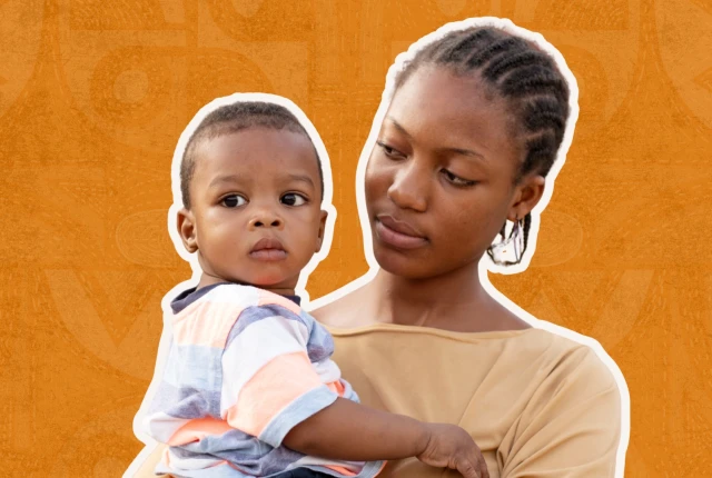
Postpartum haemorrhage (PPH) is preventable, yet it remains the leading cause of maternal deaths worldwide, claiming a woman's life every two minutes.

The World Health Organization and partners wanted to change that by sparking a movement that would unite clinicians, advocates, and communities behind one clear message: end preventable maternal deaths.

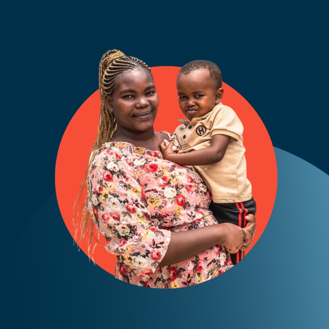
Our challenge was to bring visibility and humanity to a life-threatening issue, creating a visual identity and storytelling system powerful enough to mobilise global action while holding space for empathy, loss, and hope.

The Solution

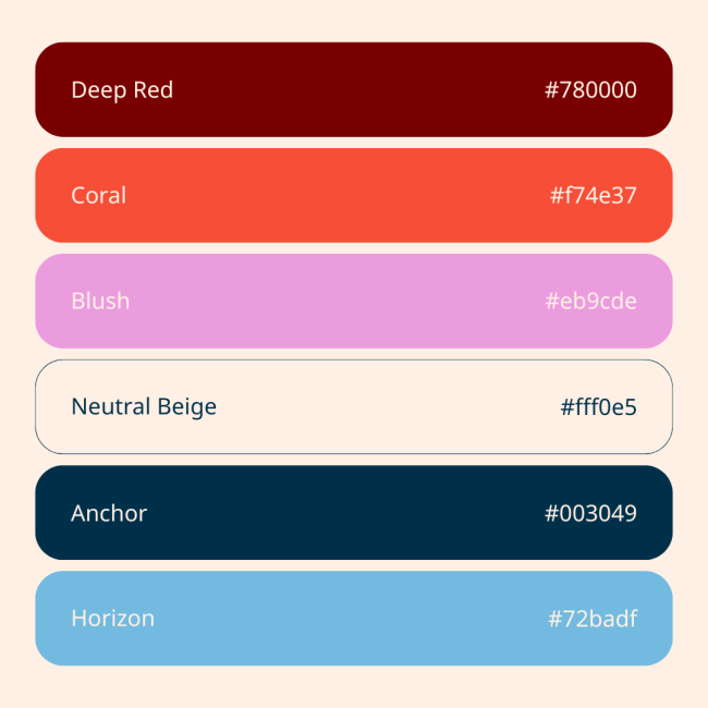
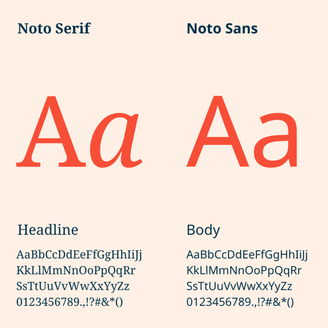
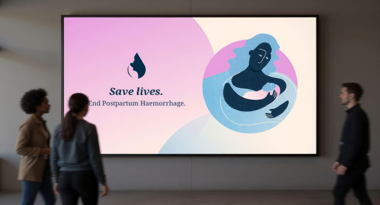
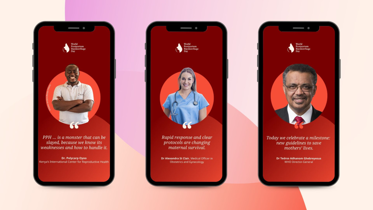
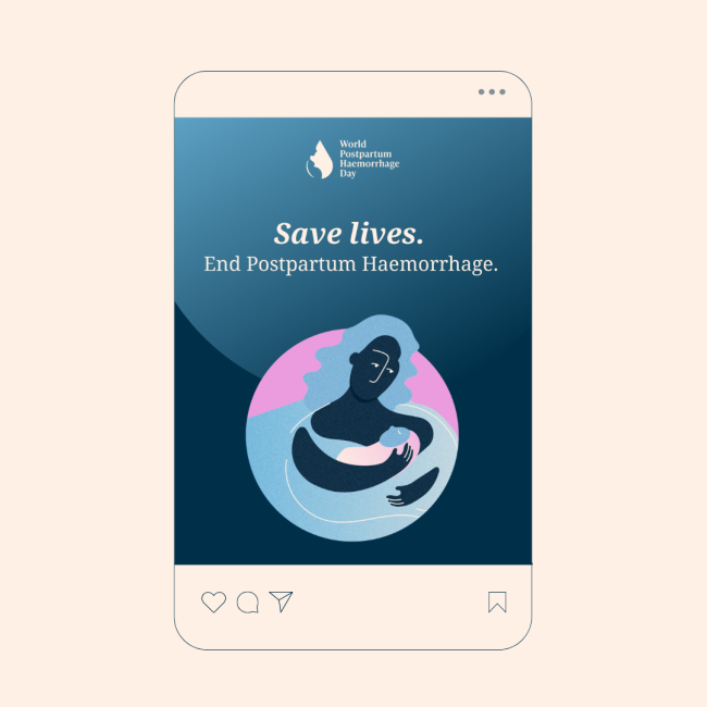
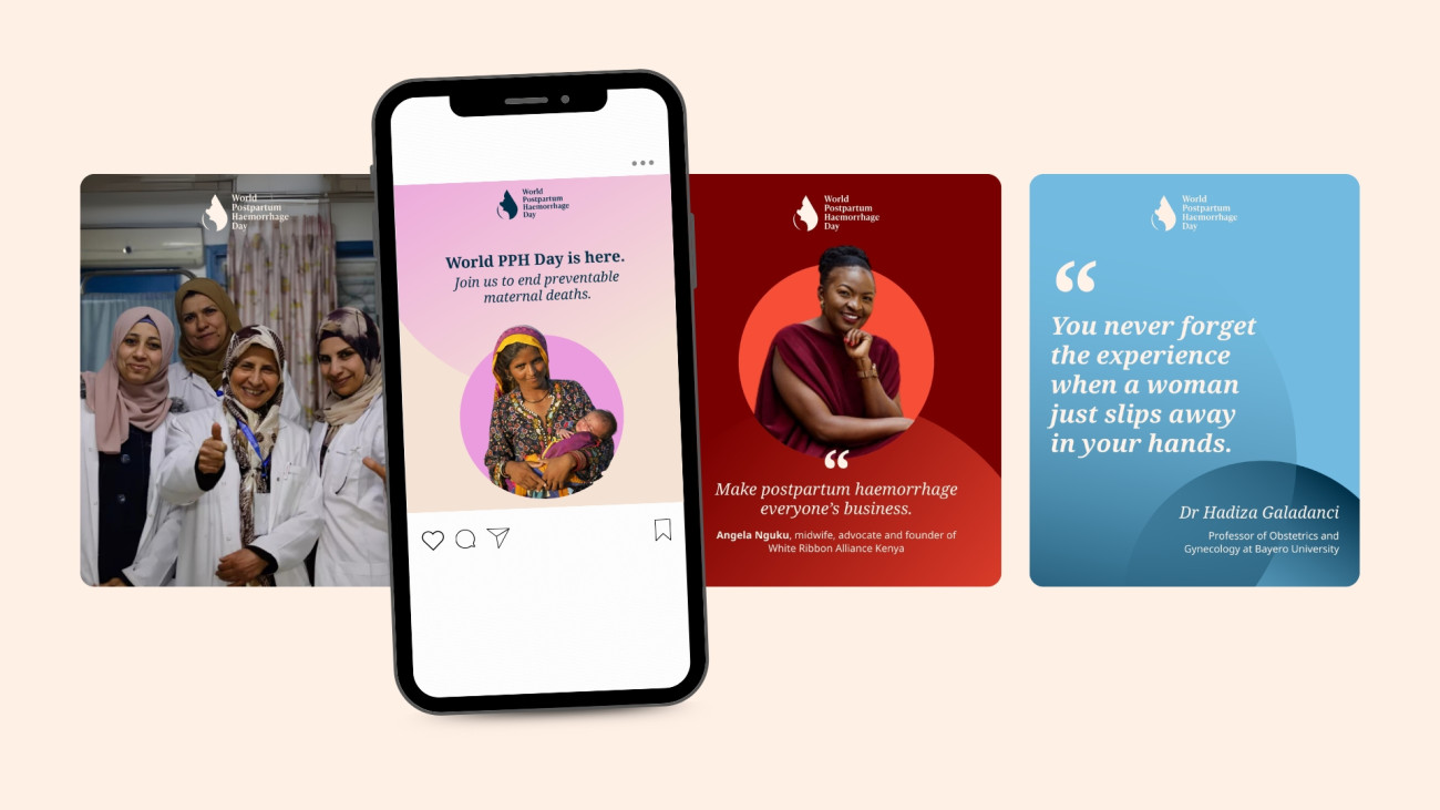
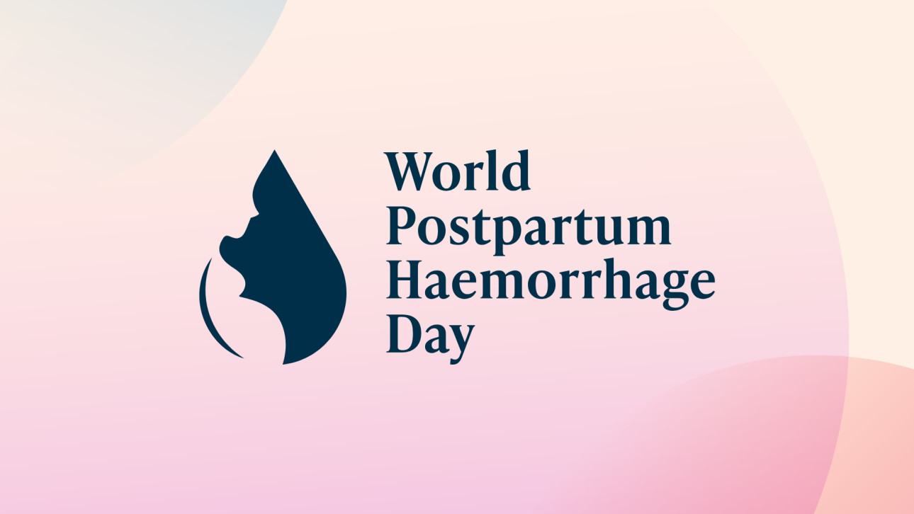
For the inaugural World PPH Day (5 October), we developed a bold yet sensitive brand and visual identity that transformed complex data and urgent health messages into a rallying call for change.

We designed the campaign’s logo, colour palette, and social media templates, balancing warmth and urgency through vibrant hues, human-centred typography, and confident messaging.

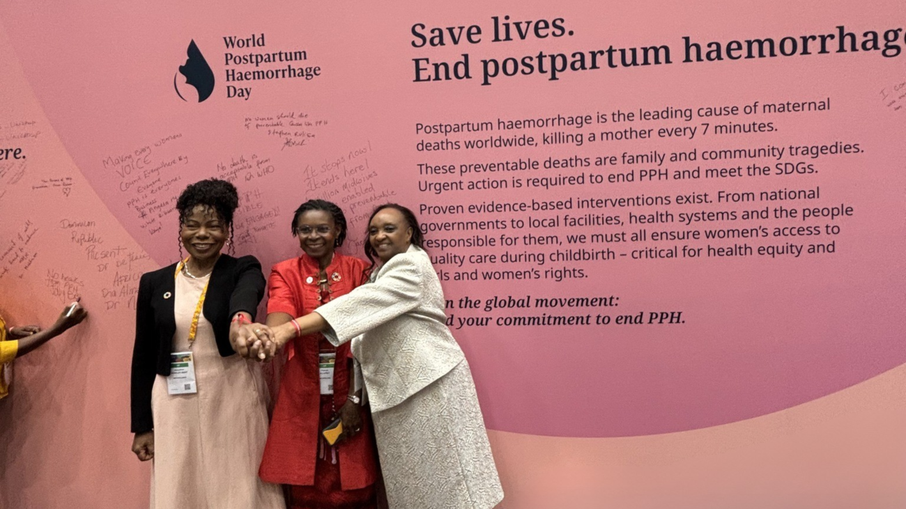
The identity helps unify health professionals, advocates, and survivors through a cohesive campaign of large-scale displays, social media graphics, and the powerful End PPH Pledge Wall at the FIGO 2025 World Congress in Cape Town.

The Results

8,000+

Health professionals at the launch event

1,500+

Likes on FIGO's Instagram post launching the initiative

40,000+

Impressions of the launch day poster from FIGO's LinkedIn

Our Journey with WHO

How do you make the world see what too often goes unseen, and care enough to act?

We listened to clinicians, advocates, and women whose lives had been changed by postpartum haemorrhage and used their voices to guide every design choice, from the symbolism of the logo to the balance of strength and softness in the colour system.

We worked closely with WHO to translate medical urgency into emotional resonance and create a visual language that could live across cultures, platforms, and moments.

Our goal was to give shape to a movement that honours survivors, supports healthcare workers, and invites the world to act.

The result was a campaign identity that stands as both a call to action and a message of care, helping to make history with the world’s first-ever World Postpartum Haemorrhage Day.

A word from our Creative Lead

I’m truly grateful for the opportunity to work on this project, a cause that is both urgent and deeply meaningful. Designing for something that can truly make a difference reminds me why I do what I do. In designing this identity, I wanted to create a symbol that feels both strong and compassionate.

The logo combines two elements: a drop and a woman’s silhouette - to represent both the urgency of postpartum haemorrhage and the central role of mothers in this story. The goal was to find a balance between urgency and humanity, creating a visual language that speaks to everyone, everywhere.

Most of all, we wanted it to bring hope because postpartum haemorrhage can be prevented, and every mother’s life can be saved. I’m honoured that this identity will carry the movement forward for years to come, together with some of the world’s leading health organisations committed to saving mothers’ lives.

Project Credits

Brand Identity Design

Future By Design

Creative Direction

Future By Design

Social Media Strategy & Development:

Future By Design